Shortening Ankle Zip Pants

Ooh! I Can Wear That Now

Have you ever looked at a fashion style and had to dismiss it because you could not see how it would work for you?

I have walked straight past pants with ankle zips. If, like me, you find all pants are too long for you, this article is for you.

I found the solution to taking up pants with ankle zips from Judith Turner in Vol 21, No 7 in ‘Stitches’ magazine. You can either do-it-yourself or take the instructions to your alterations person.

Shortened Ankle Zip PantsI bought these cheap purple pants from K Mart to try it out. Judith gives professional alterations techniques. I chose the ‘let’s skip a few instructions’ easy way. My method works best on dark colours (one seam) whereas Judith’s version works on all colours as she makes a feature of the seam.

Folding Ankle Zip Pants - by Judith TurnerFind the point just below your knee and fold over until the bottom hem is where you want it. It takes a few attempts to get it to your satisfaction (be aware of where the seam will be when you sit down). Then I sewed up the seam twice for strength on the inside. I cut the folded bit smaller, turned under the edges and zigzag sewed the edges together (about ½” final length). To make the fold less obvious, I hand-sewed the fold edges upward to the side seams.

Voila! You and I can now wear ankle-zip pants. Walk confidently and no-one notices the seam.

PS – Judith unpicks the side seams and ends up with a top-stitched feature seam whereas I just tried to downplay the seam. See her website – http://www.geniecentre.com for more alteration tips and the link to her book ‘Clothing Alteration Secrets Revealed’.

PPS – If you want to try it and cannot find the instructions, click here to email me & I will send you a PDF of the 2-page instructions from Australian ‘Stitches’ magazine.

 (Don’t miss out on upcoming articles for Baby Boomer Women. Click here to sign up for ‘The Baby Boomer Personal Stylist’ eZine and get your weekly fashion tips every Thursday from Margaret, the Baby Boomer Personal Stylist.)

Seven Steps to a Polished Professional Image

When I first trained as an Image Consultant in 2001, the business world was more formal. Dark, stiff suits were the order of the day for men and women. Times have changed. The dark suit is still required and worn in traditional corporate settings. Elsewhere dress standards have relaxed.

Still those who do business with you expect you to look and act professionally. A polished professional image gives the impression that you know what you are doing and will treat your customer efficiently and respectfully.

Today’s main article points come from ‘The Polished Professional’ eBook. The seven steps are about your dress as, from what others see of you, your dress determines 55% of the judgment they make of you.

Use these tips to help you, a Baby Boomer woman, learn and practise the skill of a polished professional image.

Baby Boomer Business WomanFirst Impressions

Next time you meet someone for the first time, take a mental note of how you feel about that person. Then analyse how much of that impression you formed was through their dress, their behaviour, their grooming, their gestures etc. practise analysing  at least one person every few days and you’ll soon discover that in image management all factors work together to create a polished professional image.

Select Five People You Know That Dress Well

Think about their appearance and how they are usually dressed. Look at how they dress, groom and accessorise themselves to enhance their professional image. Write down what you have noticed and see how you can apply thee to the way you present yourself.

Become Introspective

Think about what you have learned and how you dress, act and groom yourself. What things can you think of that would enhance your image? Find someone you trust and ask them what areas of your image they think needs changing or improving. Accept whatever they say with grace. Remember! You asked for their opinion.

Styled Red Dress - from birdsnest websiteStudy Your Clothes

Every day take something different that you wear and study it in detail. This could be a suit, shoes, lipstick or accessory. Improve on it. Change it. Combine it with something else for a new look. Buy an appropriate but different look next time you shop. Find out what works and what doesn’t and work out why.

See an Image Consultant

This is by far the best and most cost effective way to perfect your image. It will cost you less in money, time and stress than the process of trial and error. (Whether it is myself or someone else, it is the ‘Aha’ moments that move you faster towards your goals.)

Research

Read books, newspapers, magazines and Blogs. Watch videos or YouTube. Listen to takes. Study the media. All of these are excellent ways to upgrade your knowledge when it comes to professional dressing and staying current.

Dare to Ask

‘How do I look?’ This is the simplest way to get feedback. Don’t be shy. Ask those you trust and admire. People in most cases will be honest with you. However, don’t make a nuisance of yourself by asking the same question day-in and day-out. (MY TIP – Ask in private, one-on-one. Do not ask when you are in a group situation. Most people are too polite in a group to give you the answers you need to improve your professional image.)

The Polishe Professional eBook - womenLast Words

The ‘Polished Professional eBook for Women’ is a TAIC product. As I am one of their trained Image Consultants you can purchase the eBook through my website for $25.00 by clicking here.

The Polished Professional eBook - MenThere is also a ‘Polished Professional Men’s eBook’ available for $25.00 by clicking here.


(Don’t miss out on upcoming articles for Baby Boomer Entrepreneurial Women. Click here to sign up for The Fashion Translator eZine and get your weekly info every Thursday.)

How to Wear Tone on Tone Colour

It is very easy when wearing all one colour to look matchy-matchy, boring and dowdy.

I use the phrase ‘tone on tone’ to refer to an outfit exactly in the same shade of a single colour. It may be a dress and jacket, pants top and jacket or top and jacket in the same colour shade. For Baby Boomer women matching dresses and jackets are rarely worn now and matching tops and jackets remind us of the out-dated and aging twinsets of our youth.

To Modernise These Clothing Combinations remember and apply these very simple words – ‘contrast and opposites’.

Tone On Tone Outfit - from Oprah magazine, Nov 2012You do this by making one of the pieces an obviously different texture and then adding a statement necklace. The royal blue outfit on the left from Oprah magazine, Nov 2012 demonstrates this perfectly. The model is wearing a smooth-textured wool jacket over a diagonal, uneven-pleated top which creates a raised opposite texture. The contrast is provided by the gold necklace with clear crystal drops in white and blue. The glimpse of tone on tone colour texture underneath the jacket creates a quiet elegant look.


Monochromatic Plum - Simplicity 2148Contrasts and opposites always have two options. The other one is to team a flat surface bottom layer with a same shade of colour, textured jacket. The Simplicity pattern 2148 on the right has a velvet jacket over matt pants and top. Other alternative textures are lace, sheer, blingy or a hand-made wool look. Even with a casual outfit, a contrasting necklace would lift this look from interesting to stylish.

The principle of ‘contrast and opposites’ is a basic principle of stylish dressing. So try both or stick to the option you prefer.


(Don’t miss out on upcoming personal style articles for Baby Boomer Women. Click here to sign up for The Fashion Translator eZine and get your weekly info every Thursday.)

Colour Speaks Louder Than You Think

It is said that a picture speaks a thousand words. And a picture of you is made up of your natural colours and the clothes and accessories that you wear.

Those colours are speaking loudly to the senses of others. When you meet someone new, you usually see them first from a distance. Their hair and clothing colours are the areas that reach our sub-conscious first. You judge on the hair colour (and often the hairstyle) and reinforce your first impression with their clothing colours. We all do it without thinking even if you protest that you don’t. Lastly, you use their body language and words to either confirm your first colour impression or feel confused by their conflicting signals.

Hopefully as you, a Baby Boomer woman, get older and learn more about different personalities, you give others the time and attention to read their more subtle clues. BUT colour is the first thing that speaks very loudly to your left-brain senses.

Colour can have different meanings in different countries and cultures. In this article, I am concentrating on it from an Australian view which is 95+% compatible with most western cultures.

Also I am concentrating on the positive messages of the following seven colours. I want to help you subconsciously shout out loud positive colour signals.

Be aware that different shades of colours give different messages. These below are general descriptions.

The Primary Colours

Happy Woman in Yellow Floral Dress
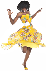
YELLOW – Yellow colours are eye-catching as it takes longer for your eyes to process yellow. In general yellow relates to the sun and it sends out a bright, cheerful and happy signal. That’s why we generally associate blondes with being happy women. Yellow is also the colour of learning and logic.

RED – Red colours are active, romantic, sexy and fiery colours. Quite often we believe that they look best on brunettes but this is not true. Medium red suits every woman. On its positive side, red is a go-getter, confident colour. Red has been deemed the colour for Baby Boomer women in their 60s, probably relating to a time to let loose and really be yourself.

BLUE – Blue colours usually relate to communication. Dark blue has long been associated with business and sends a trusting vibe out to others. Men relate to women dressed in blue as being easy to talk to.

The Secondary Colours

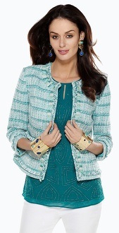
GREEN – Green colours are a mixture of yellow and blue. In general, greens are balancing colours as they are the opposite of the red skin tone of most women. Mid green is an eco-earth colour used to signify caring for the planet. Turquoise (2013 Colour of the Year) in a strong shade projects a commanding Extrovert presence and in a soft shade implies a quiet-achieving Introvert energy.

 Orange Burnout Blouse - from Chicos 2011PURPLE – Purple colours are a mix of red and blue. It has always been a spiritual or royal colour that was once hard to find. The Woman’s Movement adopted purple as one of its logo colours and now purple represents a more refined, elegant, female power colour. In its magenta shade it is a colour that supports the confidence of business women.

ORANGE – Orange is made from red and yellow. Once regarded totally with ‘cheapness’, it has updated its image. Orange is a warm, lively, people colour. Wear a deeper orange and you project a down-to-earth, easy-to-relate-to aura like this 2011 orange burnout blouse from Chicos.

The Seventh Colour

White Shirt from Chicos 2013WHITE – White is my last colour because a white shirt is touted as a woman’s must-have basic like this 2013 white
shirt from Chicos website. Be aware that when you wear white, you shout out an image of purity and complete confidence in your ideas and opinions. You know what you are doing; where you are going and why you believe it is the way to do it.


Last Words

If you own a TAIC or any brand Colour Palette, read the colour descriptions. Use them and these general comments to dress to express how you feel or how you want to feel that day. Notice how a particular colour changes your body language and your words. Then use it to read others with empathy and tolerance.

(Don’t miss out on upcoming articles for Baby Boomer Entrepreneurial Women. Click here to sign up for The Fashion Translator eZine and get your weekly info every Thursday.)

For More Reading on Colour Messages

Go to the ‘Colour Articles’ on this – https://thefashiontranslator.wordpress.com/colour-articles/

‘The Complete Book of Colour’ by Suzy Chiazzari
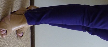
How to Wear a Modern Chanel Jacket

Everything old can be made new again. That’s the basic principle of fashion.

The Chanel Jacket, created by Coco Chanel, has been a legendary timeless classic for 60 years. It has a round neckline that comes just below your neck bone; ends just on or below the top of your hipbone; has full-length sleeves and was a modern style we Baby Boomer women all copied in the 1960s. It is usually worn unbuttoned.

Here is my personal style advice for Baby Boomer women with three ways to modernise the Chanel Jacket.

Version 1:
Chanel Jacket Vogue 8804If you want to wear modernise it a little, read the two-part article ‘A Chanel-Inspired Jacket’ by Rita Camastral in the current Vol 21 No 9 issue of ‘Dressmaking with Stitches’ magazine. Part 1 is in Vol 21 No 8. Rita has made the sleeves three-quarter length and added an interesting top under the jacket. The shell top has a centre open-weave inset that creates vertical stripes to contrast with the horizontal stripes of the jacket. This looks modern over unmatched black pants.

Version 2:
On the Chicos website I noticed two modern interpretations of the Chanel Jacket.

Chicos - Chanel Jacket in GreenChicos - Chanel Jacket in DenimMake it new again by choosing a three-quarter sleeve variation and wearing a longer top under the jacket. On the left is a white denim variation over a white top and jeans. I am not a fan of this much white; so I would change the shell top colour or add coloured accessories to lift the white. On the right is a light open-weave jacket worn over a darker green top. I think that works better.

Version 3:
Both examples have added modern accessories. On the left she is wearing silver necklace and bangle to match the silver stitching on the jacket. On the right she is wearing mid-green earrings and two chunky gold bracelets set with green stones. The bracelets add a little drama and funky edge to a timeless jacket.

There you have it. To make the old new again – Wear the timeless Chanel Jacket with three-quarter sleeves as an unmatched jacket or over a longer top with modern stylish jewellery. Old is now new again.

(Don’t miss out on upcoming personal style articles for Baby Boomer Women. Click here to sign up for The Fashion Translator eZine and get your weekly info every Thursday.)

Sorbet – A Fashion Review

While searching for a new top and doing some research at the Airport DFO, I came across a store I had not found before. It’s been there 7 years. Funny what you don’t see until it’s important to you!

The shop is Sorbet.

At first glance, it wasn’t my style. But I am writing about it because it may suit you. I picked up a catalogue and researched them on the Web.

Sorbet Brand - Blue Stripe TopSorbet Brand - Stripe TopThe two styles I have featured from them show their versatility. The one on the right has a simple grape jacket and multi-coloured stripe top. Note the lower neckline (good for baby boomers and women over 40) and the blue heels (just something a bit different). Grape softens the black pants. The one on the left has the same material from the right as a diagonal feature on the plain-coloured top. It has a black jacket which drapes down the princess line. Same blue shoes.

Sorbet has reasonably-priced clothes for all women in sizes 8 – 24 and shops in Cairns, Maroochydore, Brisbane Airport DFO, Gold Coast Harbour Town, Canberra, Melbourne and Adelaide. They feature lots of modern tops and jackets in multi-pattern and texture mixes. They do have colour as well as black. Their website – http://sorbetstyle.com.au – is basic.

After studying the catalogue in more detail, I will be back for a second look.

(Don’t miss out on upcoming articles for Baby Boomer Entrepreneurial Women. Click here to sign up for The Fashion Translator eZine and get your weekly info every Thursday.)

15 Best Summer Outfits for Work – Review

15-best-summer-outfits-work--large-msg-134263416825While surfing and researching Pinterest on the Internet I clicked on a link to ’15 best summer outfits for work’ by Lauren Berger.

Most were not suitable for my baby boomer readers but this one (N0 11 of 14) caught my eye. Do not know what happened to No 15. It is a colour combination and style you can adopt and adapt. It is a light, dark and bright colour combination.

Her mid-brown skirt could be replaced with any other plain neutral such as black, grey or a darker shade of brown.  You can substitute pants if you like. A medium or dark colour worn with a light top, jumper or shirt like this white one, draws your attention upward and away from any fault you have or think you have below your waist. The white shirt could be replaced with a cream top or shirt. This colour combination is very effective and stylish because you do not see it often. Most women think that only black and white go together successfully. You could wear your shirt tucked in or left out.

The medium-coloured turquoise accessories add the bright element and look fabulous against both the white and the brown. Remember that three is the maximum times you repeat a colour. Her belt is plain and blends with her skirt so that the necklace becomes your focal point. You could substitute aqua accessories for the turquoise as both are a great contrasts to brown. Not a fan of bangles – then wear turquoise earrings. The model is wearing a turquoise chunky ring. I would take that off. Less is more as too much colour disperses your attention.

As the necklace is elaborate, she is rightly holding a simple handbag.

Now go play with your wardrobe and see how you can adopt or adapt this style.

(Don’t miss out on upcoming articles for Baby Boomer Entrepreneurial Women. Click here to sign up for The Fashion Translator eZine and get your weekly info every Thursday.)

Colour Blocking Above Your Bust

Colour Blocking Top - Gail TColour Blocking adds variety to your wardrobe. These styles are always smart and fashionable.

The simplest way is to have the colour or pattern block above your bust line like my client and friend, Gail on the left. Unless you have very wide shoulders (ie an inverted triangle shape), this is a slim part of your body.

Choose a colour, colours or patterns that suit you (ie not too dark or depressing) as this area will highlight your face. The wrong colour or pattern will drain colour, interest and energy from your face.

Experiment to find your best length. Above the curve of your bust, as in the photo, suits every woman. When it starts on your bust line it draws attention to your bust. The best proportions of colour mix are uneven ones – 1/3 to 2/3 or ¼ to ¾ or 1/8 to 7/8.

Always wear an accessory to bring the colours together. The ideal is a scarf or necklace that includes three colours – either the two colours plus another neutral colour or all three colours in your top or dress.

Go and colour mix with confidence and shine.

(This Short Image Bite was sent to subscribers of The Fashion Translator eZine’ on 17 January 2013. Don’t miss out on receiving fashion and dressing advice for the modern business and professional Baby Boomer woman. Click here to sign up for The Fashion Translator eZine.)